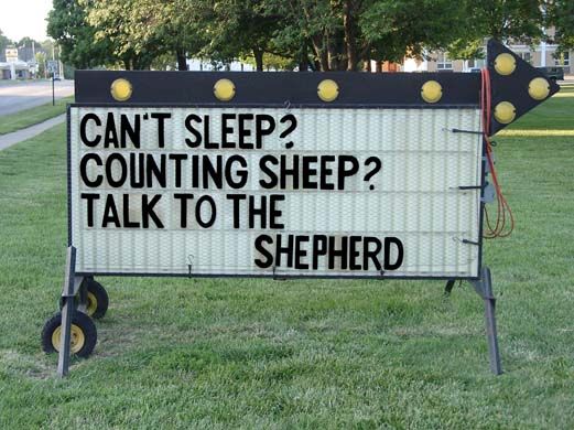
Sometimes signs can be unintentionally hilarious. This can be caused by cultural miscommunication, spelling mistakes, translation issues, or just a lack of thinking it through. When you are creating your sign, you don’t want to create something which is accidentally hilarious. In order to prevent any silly mistakes, its good to learn from the mistakes of the past.
Let’s go through some of the funniest signs.
Safety Signs
Safety signs often have to convey a lot of information quickly. In this case, the sign was trying to convey the danger of touching some wires. Due to the high voltage, touching these wires could result in death.
In order to discourage any nonsense, a $200 fine was put in place for anyone misconducting themselves around the wires. However, when trying to present all of this information, the sign text read, “Touching Wires Causes Instant Death $200 fine.” Although it was not the intention of the sign maker, it appears that after being killed by touching the wires, you will be responsible for paying the fine.
Church Signs
Churches often put messages on their front lawn signs to speak to passersby. One church wrote this message “Don’t let worries kill you. Let the church help.” The intention of the sign was to say the church can help you with your struggles, don’t needlessly suffer. But, because the phrasing it appears that the church will help you kill yourself because worries aren’t the right thing that should be killing you.
Pedestrian Crossings
Some signs are clearly made to be humorous. For example, we have all seen the signs which warn drivers of pedestrian crossings. One sign, made to mimic the style of those pedestrian crossing signs reads”drunken people crossing.” Actually posted along a local road, this sign also include a stick figure person crawling on the ground holding a bottle.
Another pedestrian crossing sign was designed in such a way as to be unintentionally funny. Originally created to convey that the area is frequented by a large number of pedestrians, the text reads “Heavy Pedestrian Crossing.” Unfortunately, the term heavy can be read in two different ways. It could be read as having a large amount of pedestrians.
But, another way to read it is the pedestrians which cross are large individuals. Some local graffiti artists noted this unintended meaning and altered the stick figure on the sign to look like a heavier individual. Its important to be mindful of alternative interpretations when designing sign text.
Subway Signs
Subways and city metros often have a variety of signs to convey safety information as well as behavioral reminders. Some of the signs to remind us of how to act on the metro includes depictions of individuals performing inappropriate actions with large lines running through the images conveying that such acts should not take place. These signs can get progressively more detailed depending on the desires of the owner.
However, the variety of inappropriate actions depicted can become quite humorous. For example, one such sign found in a subway in northern Europe depicts five different scenarios. One includes a man playing guitar and singing. The next shows a man blowing smoke from his cigarette onto a passenger making a large cloud which blocks our ability to see the passengers head.
Perhaps the funniest image depicts a man with a saw taking apart the seat next to him. Clearly these sorts of images convey information but also provide some entertainment for passengers as they ride to their destinations.
No Sign At All
Sometimes lack of sign maintenance can make an otherwise normal sign into something worth laughing at. For example, one sign clearly intended to tell people that horseback riding was not allowed in the area grew a distinctly Halloween feel. Due to a problem with the paint, the head of the horse disappeared. The sign thus tells passersby that no headless horseback riding can be done in the area.
Some signs which are successful in conveying their meaning can be seen in a humorous way simply through suggestion. Consider the signs on a theme park attraction. Most motion based rides require that all patrons keep their hands, arms, feet, and legs inside the vehicle. This is an important piece of safety information. Although most theme parks make verbal announcements of this rule, due to its important safety content, there are numerous signs depicting this idea visually.
Typically there are two individuals with their arms and legs outside the drawn line of the vehicle. Then, of course, there is a line striking through the image. Although this does successfully convey the correct idea, taken out of context it can be quite funny. For example, the image could also depict two individuals disco dancing. In this case, the sign tells people that no disco dancing in permitted in the area. That could make sense in a dance club, but much less sense in a theme park.
As we’ve seen, there are numerous reasons signs can become quite funny. When you are making a sign, these are some good points to consider if you want to be taken very seriously.
Featured images:
License: Creative Commons
Louise Williams has a strange obsession with signage. She loves to travel around the US and take pictures of funny and interesting signs. It was a natural fit for her to write for IS Installations, a company that creates and installs signs in the Bay Area.

